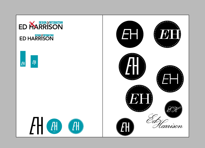
2 final logo designs for my website. The top logo plays with the idea of interaction, where the ambersand also works as a dot for the 'i' in my name. The bottom logo is an abstract form of my initials (EJH)
If you ever think your working hard when it comes to design- think again! This guy Johnny Selman, is undertaking the task of designing a poster a day based on BBC news for a whole year. Check out the link to his blog hes an ideas machine
Recently purchased a set of Rotring Isograph pens off Ebay. You can fill them with different coloured ink which is pretty nifty. Can't wait to get sketching with them
Some unknown culprits blocked our door up with snow which confused Ojay when he arrived back home drunk. It left a cool imprint on the inside when opening though
A typographic poster designed to represent 60 seconds of speech. I chose commentary for the Kentucky Derby horse race, where the winning horse was called 'Arrrrr'
We have lectures in London on ways of utilising letterpress with modern technology, in an event called 'Forward Thinking'. I got to design the leaflets for it which were printed through Elliots risograph printer which produces beautiful prints. They had to be printed and bound in 2 days which was well stressful, but looking forward to seeing them being handed out to the big dogs tomorrow. Photos of risograph process will be up shortly
(special thanks to Sully for helping fold over 200 leaflets in 9 hours!)
We were given a brief on sequences, where we had a chance to experiment with time-based formats. I was away for a week in Paris so had 6 days to do this project having never used After Effects. It was pretty stressful and meant working til 6.30am the morning of the crit but im pretty happy with the outcome - the video needs a load of editing but I hope to make it about 2-3 mins long eventually
So I went to Paris during our reading week to record a 6 track EP with my band. It was one of the best experiences of my life, spending 10 hours a day for 6 days working on the music in the studio. I stupidly didn't take my camera so all I have is this shitty photo taken with my mac in photobooth of the sound technician setting up the drum mics
We were given the task to send a postcard a week to Rose over the summer. I failed miserably, but did the project if it was a litte late.
Each postcard has a hexagon cut out that progressively gets bigger each week. As the postcards are collected a geometric pattern forms that gets more complex and colourful over time.
Tuesday, 12 October 2010
We were given the brief 'Personal Made Public' at the end of our first year, where we were free to do anything we wanted. I created an interactive website aimed to help people learn the anatomy of type. Click here to give it a go
Went bookbinding in our last week of term with Angus boy hungover as a moose. It was so satisfying spending a day making a book instead of lying in bed feeling sorry for myself. I then stitched a geometric pattern onto the cover with white thread.
Im in the process of making a typeface using log slices. Above is a quick experiment just using permanent marker- going to redo with red arcylic paint and join the slices with brass hinges so they can fold out into a sentance that i havent thought of yet...
Doing alot of woodwork with logs at the moment in my brothers workshop. Found this guys stuff while looking for inspiration it is truly amazing. See more of his work here
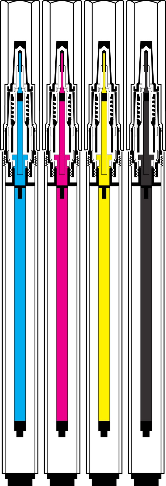
Currently working on a project where we have to send 15 postcards over 15 weeks- looking into time and growth as a theme. Did a vector graphic of a log from my garden on Illustrator. Looks cool with the points highlighted
Bought a Polaroid camera with flash, manual, case the lot for 99p in a Swansea charity shop. Bargain! Anyway I drew the beauty and developed it into the illustration above